New Logo Design! Rough Drafts

Status
Not open for further replies.
My apologies, not really used to projects without deliverable dates... just looking for a timetable. Would like to ensure we don't repeat the stagnation of the submissions from December.

If you have a plan for this process, can you share it on another thread? I feel like there may be some easy was to simplify all of this.

Sorry for any miscommunication on the previous events. Rather than a stagnation, it was a conscious abandonment of logo design due to a lack of support caused by other club priorities. Hence, why I am so appreciative for all the support this is getting now!

I don't believe its exactly fair for me (or any of us) to assign deliverable dates. We are all volunteers. I think doing so would just cause additional unnecessary stress on people.

Nonetheless, there will be other threads on this shortly. But there wont be threads for every step of this process, just as there aren't threads for every other process that we do.
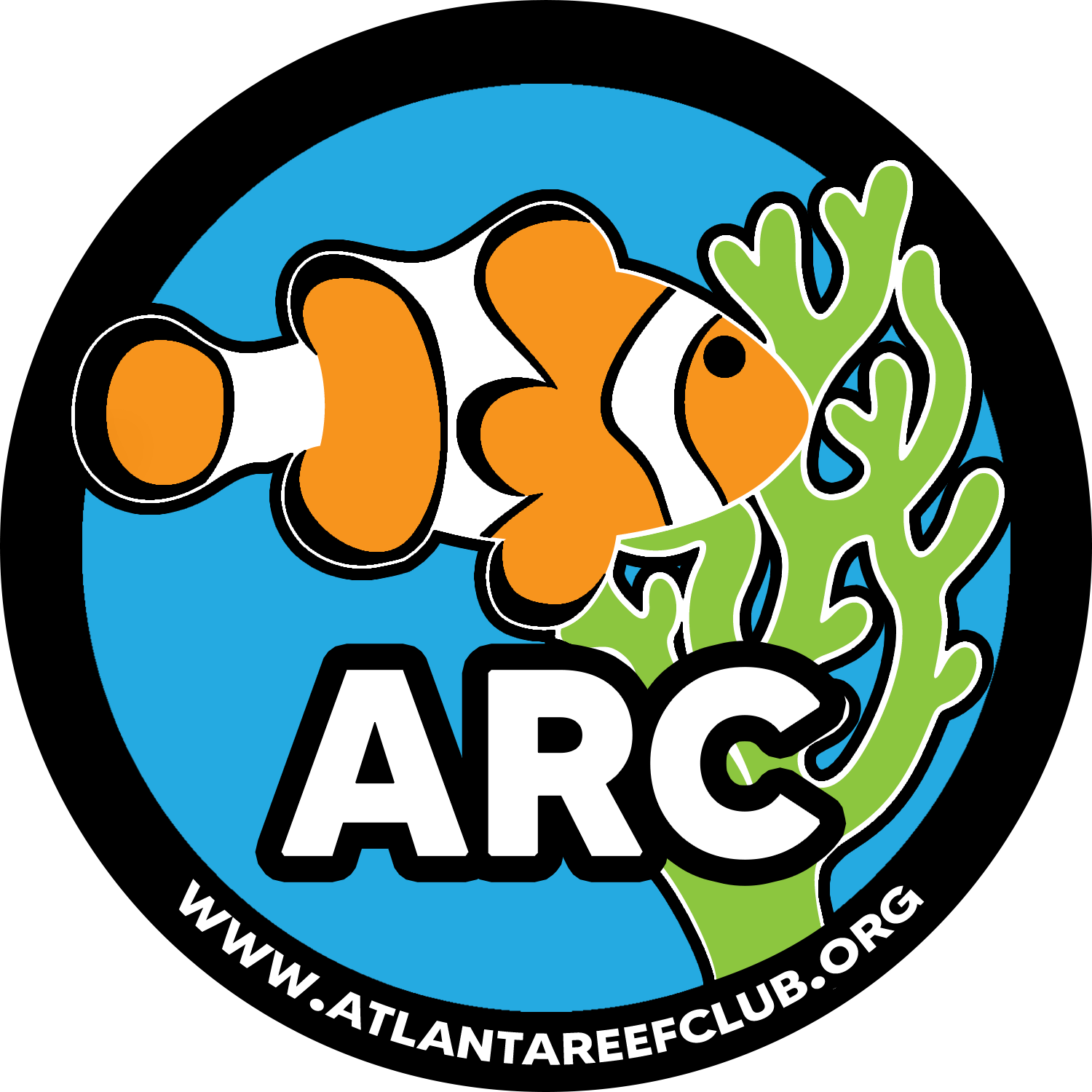
 
How about changing the red coral to purple or green. Swap out the yellow tang to a ordinary clown or two. Two clowns could represent a gathering of some; I.e. club members coming together.
- just my 1/4 cent.

P.S. A reef tank isn’t a reef tank without some clowns in the mix of things. - wannabee
If you change it to green and put a clown fish on it its basically what we have now :) I would vote for that.
 
If you change it to green and put a clown fish on it its basically what we have now :) I would vote for that.
I’m growing older. Call me ole fashioned! Changing now is too late for me! I’ll stick to the “tried and old faithful”. Clown fish is where it’s at. At least in my little world.
 
I’m growing older. Call me ole fashioned! Changing now is too late for me! I’ll stick to the “tried and old faithful”. Clown fish is where it’s at. At least in my little world.
Im with ya. I would venture to say just about every reef tank in America has or has has some clowns in it
 
  • Like
Reactions: bzb
Revisiting this...

@ActiveAngel and I discussed a couple more ideas, but unfortunately, I haven't had time to develop any additional concepts - or even post up on my favorite forum lately!

And to be honest... the more options we present, the more convoluted this process gets and as you see above... it just circles back to the old one ;) Curious what the next steps are.
 
No worries. I concluded you were busy, so wanted to give you space. I don’t follow the convolution nor exactly what you mean by ‘circling back around’. I haven’t seen us circle back around to anything since we started. Rather, it seems like we progress forward and then slow, forward then slow,...

I was teaching myself illustrator (as you remember from our phone conversations). After hearing you explain that it was very complicated and how easy it was for you, I got the impression that you wanted my trust to handle it. And you certainly have it; your designs are consistently great! (But I also don’t mind picking illustrator back up, it’ll just be a little slow til I get rolling.)

I’m happy you’re willing to revisit this! Let’s chat today and continue our progress
 
To clarify: the exchange above my post shows that there are a few folks that are leaning toward my original design (i.e. circling back to the beginning). Convoluting the process is offering TOO many choices: choice overload is a topic of discussion every year in my industry, and simplification of choice is a huge driver in consumer-based marketing. Think "Extra Value Meals" at McDonald's, or how the Coke machines with a billion different flavors still have the quick buttons at the front of the UI to get Regular-Ole-Coke, Sprite, etc.

Essentially, I'm not really interested in spending more time drawing and submitting additional designs and pontificating on their application. Everyone is going to have a different opinion on brand design, iconography, colors, etc.

I appreciate the trust in my skills... but if it's left up to me as the designer: I like a couple of the designs that have been submitted and can explain why I believe they evoke the tenets of the club. If we leave it up to the members to vote to select the design, it can then be further refined for specific usage as the club's new brand. If it's deemed that none of the submitted ideas are worthy of refinement, I suppose we can revisit committing more time on developing concepts, or look to hire someone externally.
 
Ah ok. I understand what you are saying. However, I disagree with your assessment.

I completely agree that people will have different opinions. That is why we gathered feedback from the membership on those opinions, their thoughts on the old logo, and the characteristics they would like in the new logo. Then through research, combined this feedback to create the guidance and limitations for our logo designs. During our last conversation, I believed you understood how your previous submissions, while great, haven't complied with these. I felt that we finally had a meeting of the minds, and is why I was excited to see a any of the upcoming design submissions. (Note: This is not to say that the ideas weren't great. They were. It just seems like they were developed independently or without regard to the provided guidance as determined from general membership and the board.)

I'm sorry that you are no longer interested in making more designs. That is okay. I'll shoot you a call in a few minutes because this really should be a conversation. If you disagree and believe your designs are in line with the guidance, I am all ears and open for anything!
 
I like the cleanliness of these designs too. Just for inspiration.

This one is my favorite as I could see it on the back of a shirt or on a pocket tee. Instead of arrows at the top do some coral and Atlanta reef club in the text with a clown or tang as the fish.

C1296FE6-6B53-4AC4-A0DC-E27B2484B11D.jpeg


3AFF737B-13E4-4492-83AF-8F7440E30955.jpegBEB4EBF1-2A99-42A3-A6FE-F156F69867A5.jpeg
 
Status
Not open for further replies.
Back
Top